1. PROBLEM IDENTIFICATION
Orientation difficulties resulting from illegible directional signs, street names and
numbering and/or the lack of them.
Pedestrian accidents due to badly positioned signs.
Hazards due to lack of warning and traffic signals.
Non-identification of access routes and accessible facilities.
2. PLANNING PRINCIPLE
To facilitate orientation mainly for the disabled.
3. DESIGN CONSIDERATIONS
3.1 General
 Signage include direction signs, signs of
locality, street names and numbering, information signs, etc. Signage include direction signs, signs of
locality, street names and numbering, information signs, etc.
All types of signs should be visible, clear,
simple, easy to read and understand, and properly lit at night.
In general, signs should not be placed behind
glass because of possible reflection.
Signage placed on the pedestrian path of
travel are considered obstructions; thus, they should be detectable (see Obstructions).
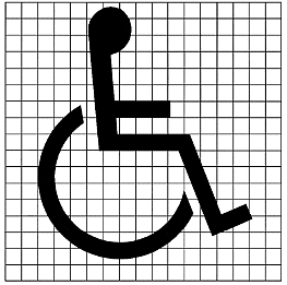
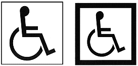
3.2 International symbol of accessibility
Accessible spaces and facilities should be
identified by the international symbol of accessiblity (fig. 1).
The symbol is composed of a wheelchair figure
with either a square background or a square border (fig. 2).
Contrasting colours should be used to
differentiate the figure from the background. The commonly employed colours are white for
the figure and blue for the background.
The wheelchair figure should always be seen
from drawn facing right.
For completely accessible buildings, it is
enough to have one explanatory sign at the entrance.
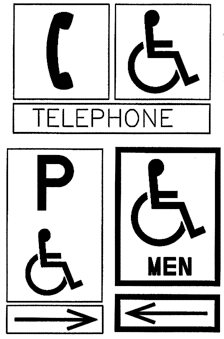
3.3 Direction signs
Graphic or written directions should be used
to indicate clearly the type and location of the available facility (fig. 3).
Directional signs need not be excessive in
number, but they should be placed at main entrances and doors and in places where changes
in direction or level occur.
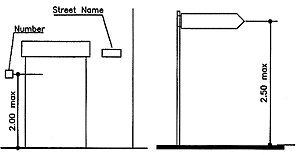
3.4 Street names
Fixed signs indicating street names should be
placed at a maximum height of 2.50 m (fig. 4).
3.5 House numbers
Fixed signs indicating house numbers should
be placed at a maximum height of 2.00 m (fig. 4).
3.6 Maps and information panels
Maps and information panels at building
entrances, along roads, and on public buildings should be placed at a height between 0.90
m and 1.80 m (fig. 5).
3.7 Installation
Signs can be wall-mounted, suspended or
pole-mounted.
(a) Wall-Mounted signs:
Wall-mounted signs, such as those indicating room numbers, should be placed with the
centre line at a height between 1.40 m and 1.60m from the finished floor level.
(b) Overhanging signs:
Overhanging signs should allow a minimum clearance of 2.00 m (see Obstructions).
(c)Pole-Mounted signs:
(see Obstructions)
3.8 Shape of signboards
Information signboards should be rectangular.
Warning signboards should be triangular.
Interdictory signboards should be circular.
3.9 Colour
The colour of signs should contrast with the
surrounding surface so as to be clearly distinguishable.
The commonly used colours are: white, black,
yellow, red, blue and green.
The colour combinations red/green and
yellow/blue should not be used in order to avoid confusing colour- blind persons.
3.10 Surface
The sign surface should be processed to
prevent glare.
Engraved texts should be avoided unless they
are coloured. Relief prints are advisable.
Key plans, orientation signs and push buttons
in lifts must have a text in Braille or in relief. (1)
3.11 Lettering
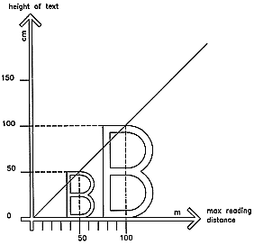
The size of letters should be in proportion
to the reading distance (fig. 6).
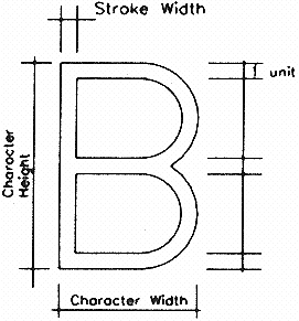
Character width-to-height ratio should be
between 3:5 and 1:1 and the character stroke width-to-height ratio should be between 1:5
and 1:10 (fig. 7).
The letters and signs should preferably be
raised at least 1 mm from the background, to enable sightless people to read the
information using the tips of their fingers.
The smallest letter type should not be less
than 15 mm.
Normal spacing between words and letters
should be used.
4. EXISTING CONSTRUCTIONS
The international symbol of accessibility
should be added to mark accessible spaces and facilities.
Directional signs should be added to indicate
clearly the location and function of accessible spaces and facilities.
Signs that do not comply with the above
design requirements should be modified or replaced.
Notes:
(1) Not all sightless persons are familiar with Braille. |